What does the Color Industry have to say?
“The color industry wants to soothe us with energizing shades in 2024, but some of us are looking at deeper hues.”
In 1999, Pantone, the company that standardized how the design industry specifies color, began naming its first “Color of the Year”. Pantone’s objective is to “engage the design community and color enthusiasts around the world in a conversation around color.” So thankful that this conversation is alive and well. US paint companies like Benjamin Moore, Sherwin Williams, Farrow and Ball and others have since chimed in creating annual “it” colors and fitting into a broader color palette, taking part in the discussion.
To select these colors, experts draw correlations between color and culture. Recent events and are looked at, along with art exhibits and social happenings, decreeing color as a salve.
An example given in the recent Boston Globe piece by Marni Elise Katz, is Pantone’s 2009 pick, describing “Mimosa,” as a color that expresses “hope and reassurance in a time of economic uncertainty and political change.” The company described its 2023 color, “Viva Magenta,” as promoting “experimentation and self-expression.”
Pantone’s pick for 2024 “Peach Fuzz” unveiled on December 7. How are these forecasts used to interpret our experiences, anticipate our needs, and steer our emotions for the coming year? Good question.
The color industry wants to soothe us with energizing shades in 2024, but some of us are looking at deeper hues.
After the bold self-expression of 2023, many companies selected shades meant to soothe, balance, restore, energize, and uplift. I find it fascinated how quickly we are blanketed in new trends. As an independent interior designer I beat my own color drum.
Here are other links to other Color of the Year 2024 picks.
Benjamin Moore’s Blue Nova 

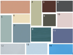
Color Key from Globe article picks above: 1. HGTV Home by Sherwin-Williams “Persimmon” 2. Graham & Brown “Viridis” 3. Rust-Oleum “Chocolate Cherry” 4. Behr “Cracked Pepper” 5. Valspar “Renew Blue” 6. Glidden “Limitless” 7. Dunn-Edwards “Skipping Stones” 8. Minwax “Bay Blue” 9. Dutch Boy “Ironside” 10. Dulux “Sweet Embrace” 11. Benjamin Moore “Blue Nova” 12. Sherwin-Williams “Upward” 13. C2 “Thermal” and 14. Krylon “Bluebird.”